
Structural Drawing Conventions: Line Types, Weights, and Clear Communication
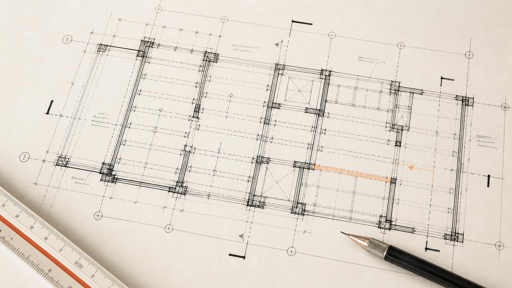
Structural drawings are a visual language. Line types, line weights, symbols, dimensions, and notes work together to tell the contractor what exists, what is being cut, what is hidden, and what must be built. When those conventions are used consistently, a dense drawing becomes easier to read and less likely to be misunderstood.
Why line hierarchy matters
Not every line should compete for attention. The eye should find the primary structural information first, then supporting geometry, and finally dimensions and reference information. This visual order is called line hierarchy. It helps a reader understand a drawing quickly, even when it contains many overlapping systems.
A good hierarchy usually uses three practical weights: heavy, medium, and light. The exact pen width depends on office standards and drawing scale; the relationship between the weights is more important than a particular number.
Heavy lines: elements cut in section
Heavy lines identify material that the drawing’s imaginary cutting plane passes through. In a building section, this may include concrete slabs, foundations, walls, beams, columns, or steel members. In a plan detail, a heavy outline may define the primary object being detailed.
We draw cut elements heavily because they are closest to the viewer and usually contain the most important information. A section should remain understandable at a glance and after printing or reduction.
Medium lines: visible structural edges
Medium lines show visible edges beyond the cutting plane. Typical examples include beam edges in a framing plan, slab boundaries, wall faces, openings, column outlines, connection plates, and the profile of an element seen in elevation.
These lines should be clear without overpowering cut geometry. If every visible edge is heavy, the reader can no longer distinguish between an element being cut and one being viewed beyond.
Light lines: dimensions and supporting information
Light lines are used for dimensions, extension lines, leaders, hatching, grids, centerlines, layout references, and other supporting information. They must remain legible but should sit behind the structural geometry visually.
Light does not mean faint or disposable. A line that disappears when printed is not useful. It should be thin, crisp, and sufficiently dark for the final output size.
Common structural line types
Continuous lines
A continuous line represents a visible edge or boundary. Its weight tells the reader whether the element is cut, is a primary object, or is supporting geometry.
Dashed hidden lines
Short, evenly spaced dashes show elements concealed above, below, behind, or within another object. Examples include a footing below a slab, a beam beyond a wall, an embedded plate, or an opening outside the current view. Hidden lines should be used selectively; too many can make a drawing harder to read.
Centerlines
Centerlines commonly use an alternating long-dash and short-dash pattern. They locate the center of columns, anchor rods, holes, circular elements, and symmetrical members. Dimensions often reference centerlines because a center is usually more reliable for layout than an outside face.
Grid lines
Grid lines are light reference lines that terminate in labeled bubbles. They provide the shared coordinate system used by architectural, structural, and building-services drawings. Columns, walls, and major framing elements should be located consistently relative to these grids.
Break lines
Break lines indicate that a portion of a long or repetitive element has been omitted. They allow a beam, wall, or reinforcing bar to fit within a detail without implying that the element ends at the break.
Section and cutting-plane lines
A cutting-plane line shows where a section is taken and includes arrows indicating the viewing direction. Because it connects a plan or detail to another view, it should be prominent enough to find without being confused with structural geometry.
What structural engineers typically draw
A structural set usually moves from general information toward increasingly specific construction information:
- General notes and design criteria establish materials, loads, codes, abbreviations, and overall requirements.
- Foundation plans locate footings, grade beams, foundation walls, piers, slabs, and anchor points.
- Framing plans show beams, joists, girders, columns, bearing walls, deck direction, openings, and member designations.
- Elevations and sections explain vertical relationships, levels, depths, steps, and how assemblies pass through the building.
- Details enlarge connections, reinforcing arrangements, edges, penetrations, and conditions that cannot be communicated clearly at plan scale.
- Schedules organize repeated information such as member sizes, footing types, columns, reinforcing, or connections.
Plans, sections, and details have different jobs
A plan is best for location and overall arrangement. A section explains vertical relationships and construction through an assembly. A detail shows exactly how a specific condition is formed or connected. Trying to place all three kinds of information into one view creates clutter and increases the risk of conflicting instructions.
Show information once at the view where it communicates most clearly, then use references and callouts to connect related views.
Dimensions should communicate design intent
Dimensions should locate structural elements from stable references such as grids, control lines, levels, or established faces. Avoid long chains of small dimensions when a contractor needs an overall controlling dimension. Do not dimension the same condition differently in several places.
Where accuracy matters, state the dimension directly rather than expecting someone to scale the drawing. The written dimension governs because printed and digital drawings may be reduced, enlarged, or reproduced at an unintended scale.
Symbols, tags, and notes
Member tags, detail callouts, section markers, elevation symbols, weld symbols, reinforcing marks, and revision clouds compress repeated information into recognizable references. Each symbol should be defined by the drawing legend or an accepted office standard.
Notes should be concise and placed close to the condition they govern. Use leaders with clear endpoints, avoid crossing dimension strings, and do not rely on vague phrases when the requirement can be stated directly.
Consistency is more important than decoration
Structural drawings are working documents. Their purpose is to communicate scope and design intent accurately—not to add graphic complexity. Use the same line type for the same meaning, the same tag style for the same kind of element, and the same terminology throughout the set.
Before issuing a drawing, review it at the size at which it will actually be read. Confirm that cut elements stand forward, visible edges remain clear, dimensions are subordinate but legible, references lead to the correct views, and no line type has two conflicting meanings.
A practical rule to remember
Draw what is cut heavily, what is seen clearly, and what only supports the explanation lightly. That simple hierarchy gives structural drawings depth, improves navigation, and helps everyone—from engineers and drafters to reviewers and contractors—understand the same information in the same way.